Client: Borweld
Product: Mobile line boring machine
Goal: Make the machine visually distinctive, modern, and emotionally engaging.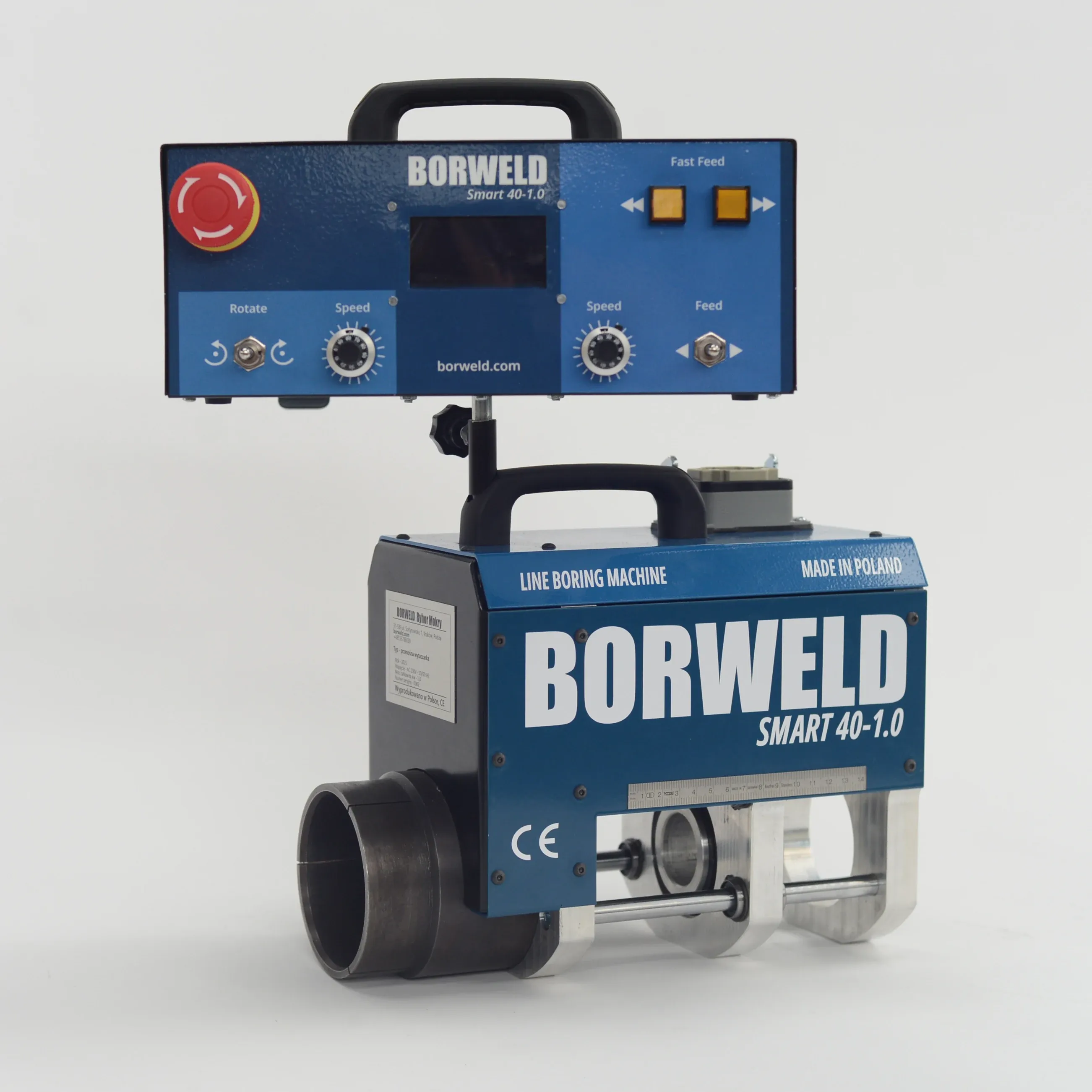
🛠 Background
The mobile boring machine market is filled with technically solid but visually outdated products. The line boring machine market is filled with powerful and well-established equipment. However, many designs have remained visually unchanged for years — built with a strong focus on functionality, but with less attention to modern visual identity.
We knew that launching a new machine wasn’t enough; we had to stand out visually and emotionally.
Moreover, there was concern that someone might say we had copied another brand’s design. So we made a bold decision — create a unique visual identity that no one would confuse with anything else on the market.
🎯 Design Objectives
Visually differentiate Borweld from all competitors Add emotional connection through color and personalization Build pride of ownership — something worth showing off Inspire social sharing — make people want to photograph it Subtly encourage inclusivity by making it appealing to women too
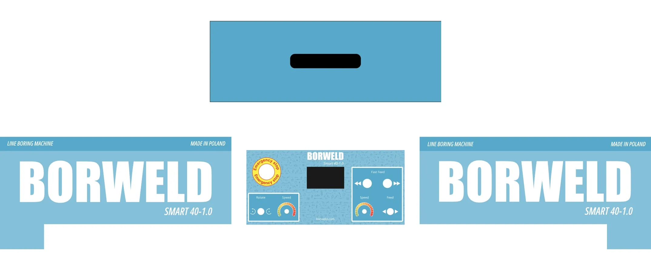
✨ Key Visual Features
🔸 Large Front-Facing Branding The machine proudly displays the BORWELD name in bold, oversized letters — immediately visible even from a distance. It reinforces trust and acts as a constant advertisement during jobs on-site.
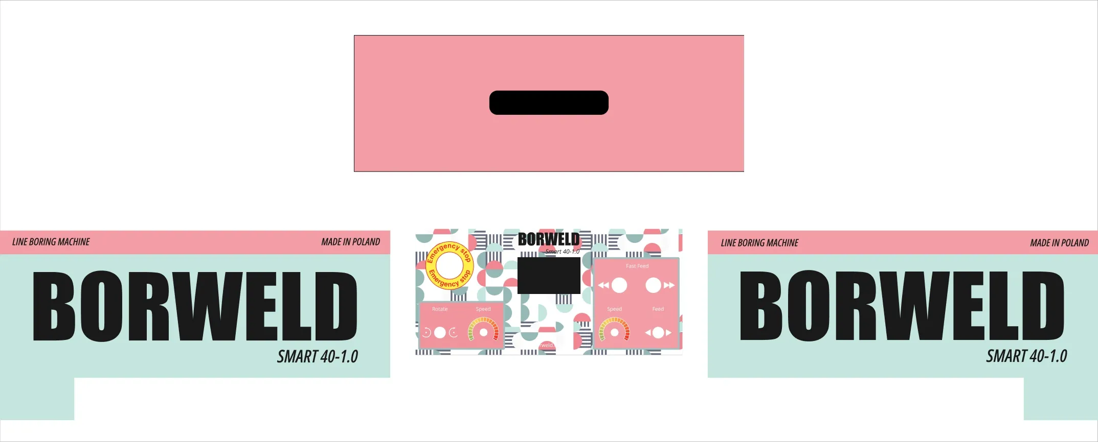
🔸 Custom Color Options Each client can choose the color scheme of their own machine. This does two things: Makes the machine feel personal and custom-built Encourages owners to share it on social media or show clients — creating organic brand exposure We designed a few standout palettes — including bright sky blue, clean gray with yellow, and even pastel pink-mint — making the machine memorable, eye-catching, and unlike anything else on the market.
👩🔧 Designed for All
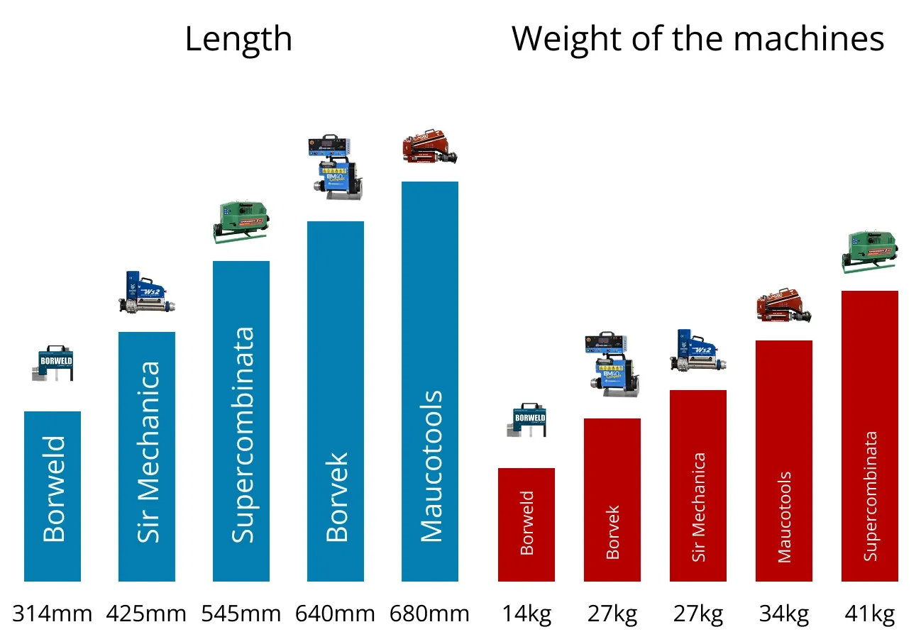
Traditionally, line boring is a male-dominated job. But Borweld Smart 40-1.0 weighs only 13.7 kg — almost half the weight of most competitors (25–27 kg). This makes it accessible even to smaller-framed technicians, including women. By offering fresher color options (including ones more likely to appeal to women), we aim to lower entry barriers and attract a wider range of new business owners into this niche market.
⚖️ Balancing Engineering & Design
As often happens in manufacturing, the machine’s engineering came before the visual design. This meant the design team had to work with constraints — a fixed form factor, available space for decals, and real-world materials. Despite that, design won. We created an identity that is functional, visually strong, brand-aligned, and emotionally resonant.
✅ Outcome
A machine that can’t be confused with any other on the market Bold visuals that support brand recognition Emotional ownership and increased visibility online Design that helps sell both the machine and the service A compelling entry point for a more diverse user base.
👉 If you're interested in working together — feel free to reach out!
info@avsievich.eu
Author