Borweld Logo – Case Study
Brand: Borweld Industry: Industrial
Equipment / Portable Line Boring Machines
Focus: Precision. Rotation. Restoration.
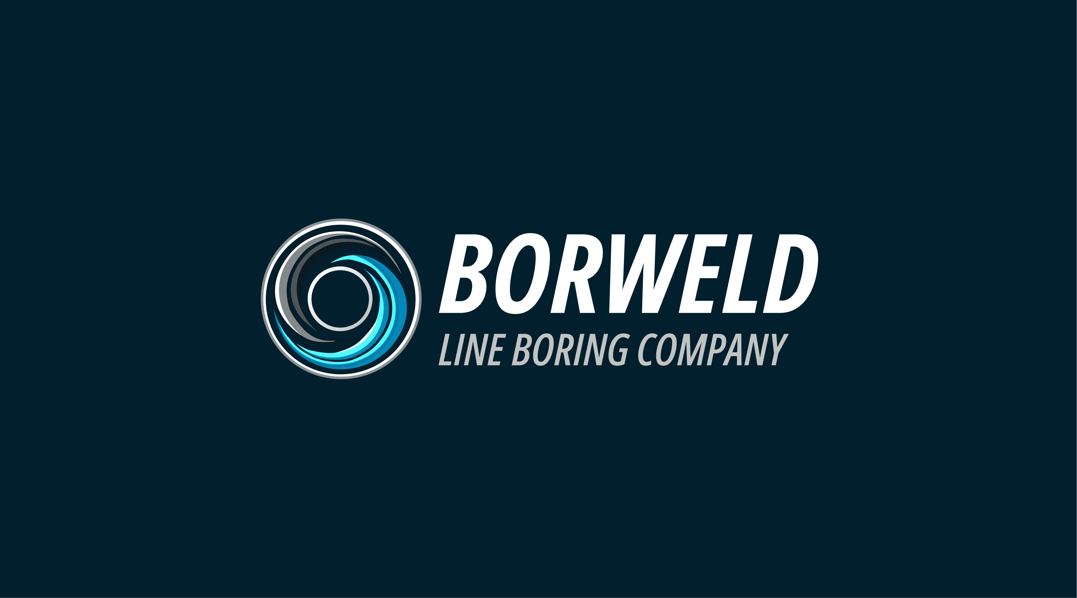
🎯 Concept & Symbolism
The Borweld logo is inspired by the core processes behind our business: boring (precision machining of circular holes) and welding (automated circular surfacing of damaged areas). At the heart of both processes lies rotational movement around an axis — this is visually represented by concentric, spiraling elements that orbit the central core in the logo.
🎨 Color Meaning
Black & Grey: Represent industrial-grade steel and metal — the raw material at the heart of every repair. These tones evoke strength, durability, and precision. Blue & Light Blue: Symbolize the welding process and arc heat. In our machines, surfacing is automatic and moves in a circular path — just like the smooth lines of blue in the logo. The transition from cold metal tones to electric blues reflects the transformation process: 🛠️ From worn-out to restored.
⚙️ Form & Function
The central black circle reflects the core of a worn hole The surrounding curves mimic both the cutting path of a boring bar and the circular motion of automated surfacing The logo feels dynamic, modern, and mechanical — just like the Borweld Smart 40-1.0
✅ Result
The final logo balances technical identity with visual fluidity. It tells a story of: Rotation Metal Precision Regeneration It’s instantly recognizable and fully aligned with the product’s real-world functionality.

👉 If you're interested in working together — feel free to reach out!
info@avsievich.eu
Author